Website · Concept · 2026
Ostro
A hotel on a sea cliff in Salento
- Role
- Concept, brand, art direction, copy, UX/UI and build
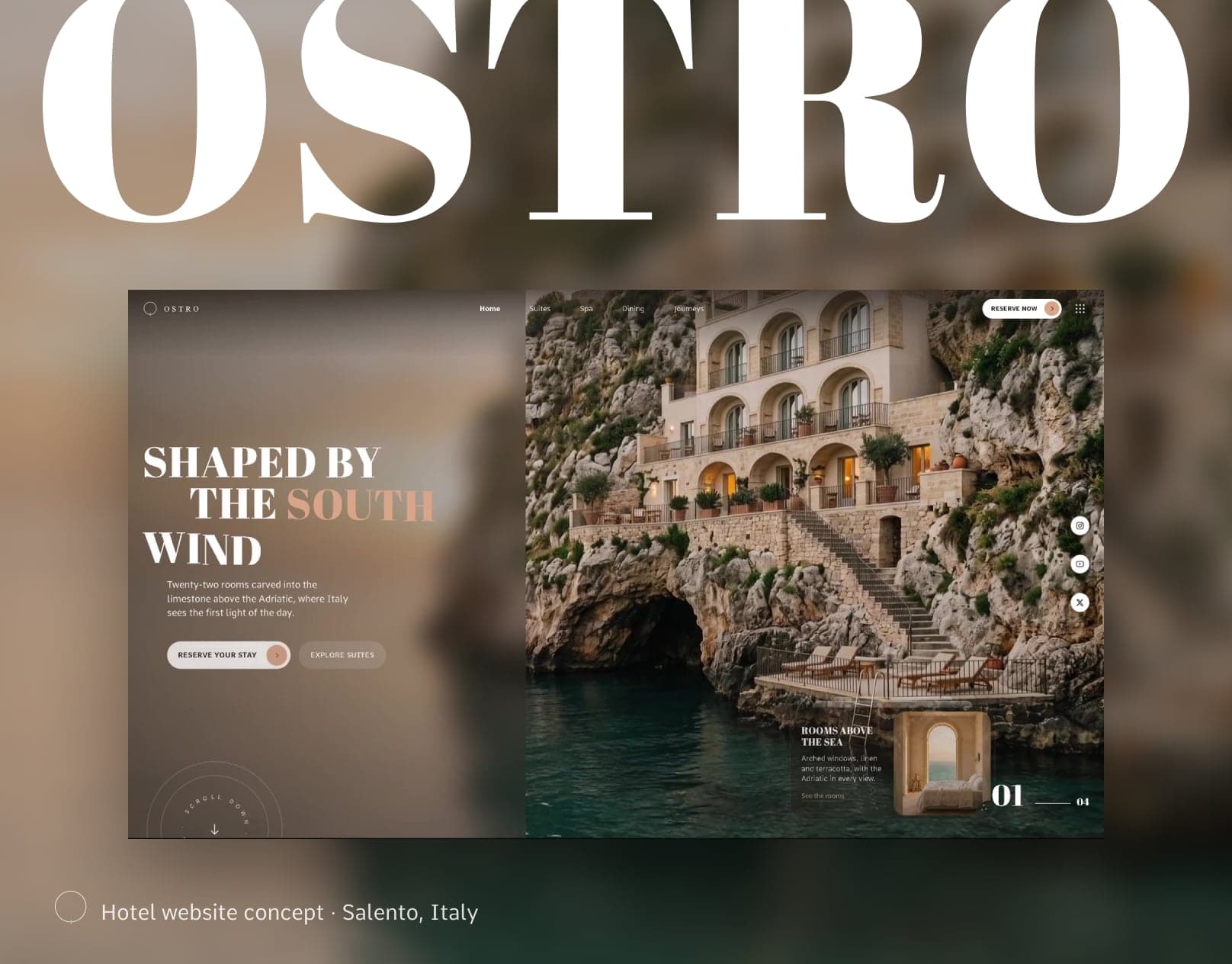
01 · Brief
Feel the place first. Book it in a few clicks.
Boutique hotels sell a feeling: the light, the stone, the view from the bed.
What I made
A brand and a working one-page website for a fictional hotel: identity, imagery, content, UX and front-end.
For whom
Travellers choosing a small, design-led hotel. They look at photos before prices and want to picture the room before they commit.
The question I set myself
Can a website create an experience without slowing people down on their way to booking?
02 · The usual way vs mine
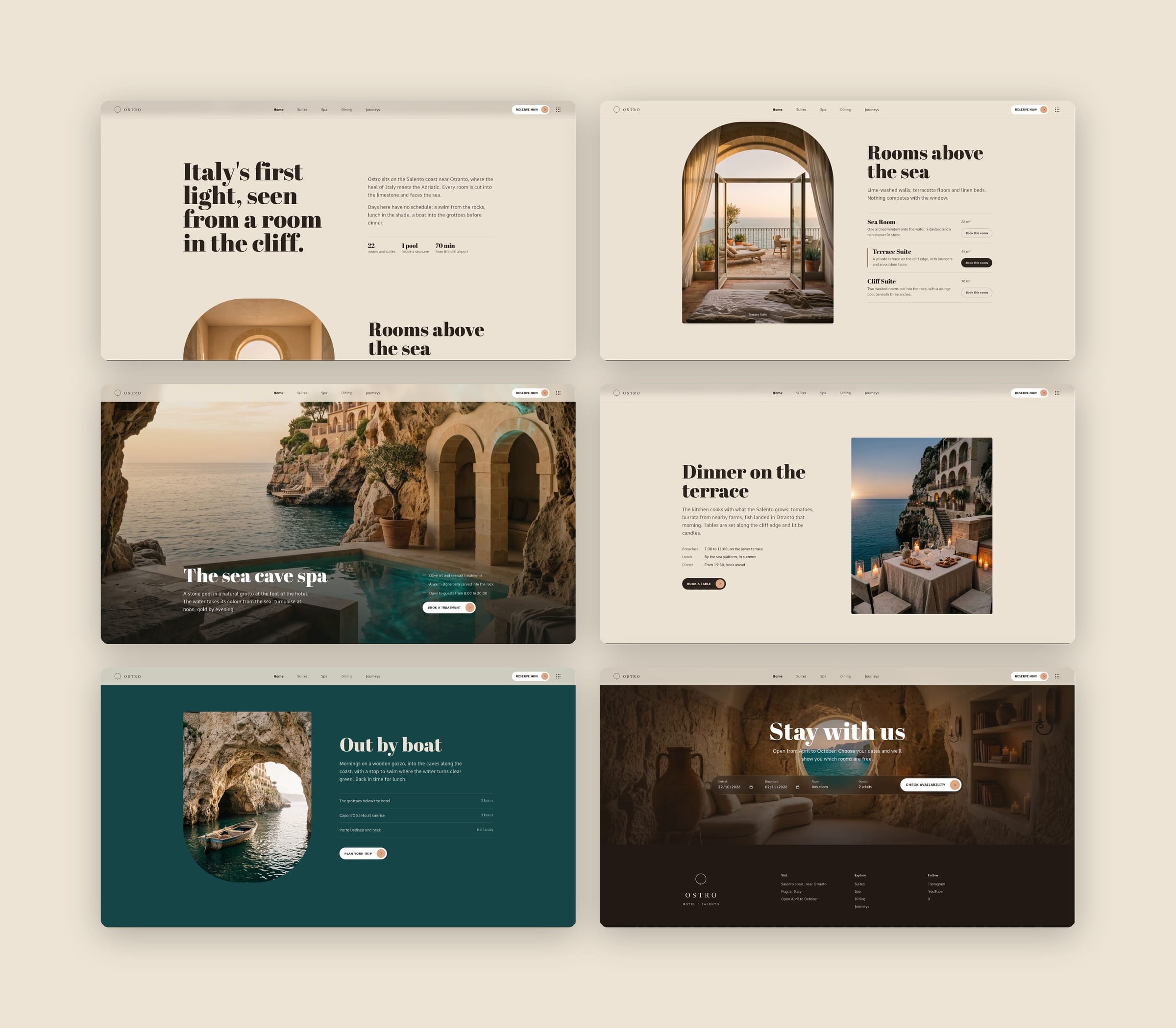
The page follows a guest's route through the hotel.
Many hotel websites show the place as a slideshow and then send you to a booking form.
I wanted the first scroll to feel like arriving, and every section to still end in something you can book. Three scroll scenes take you from the sea into the rock. After that, each section answers one question and ends in one action, so nobody has to scroll back up to book.
03 · Direction
A hotel you arrive at, before you book it.
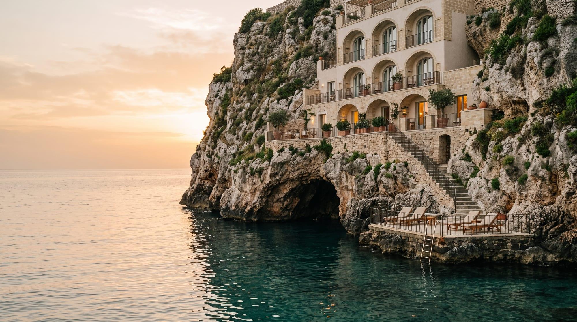
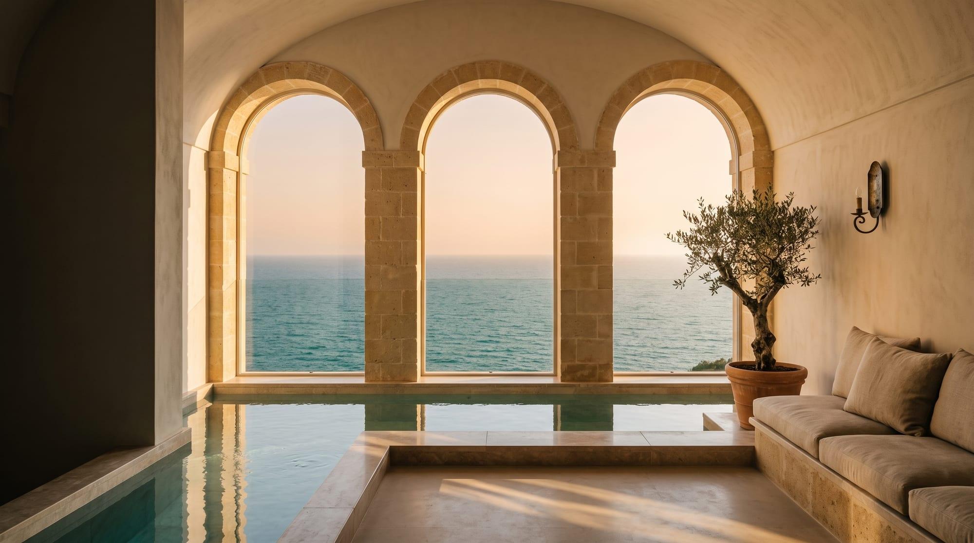
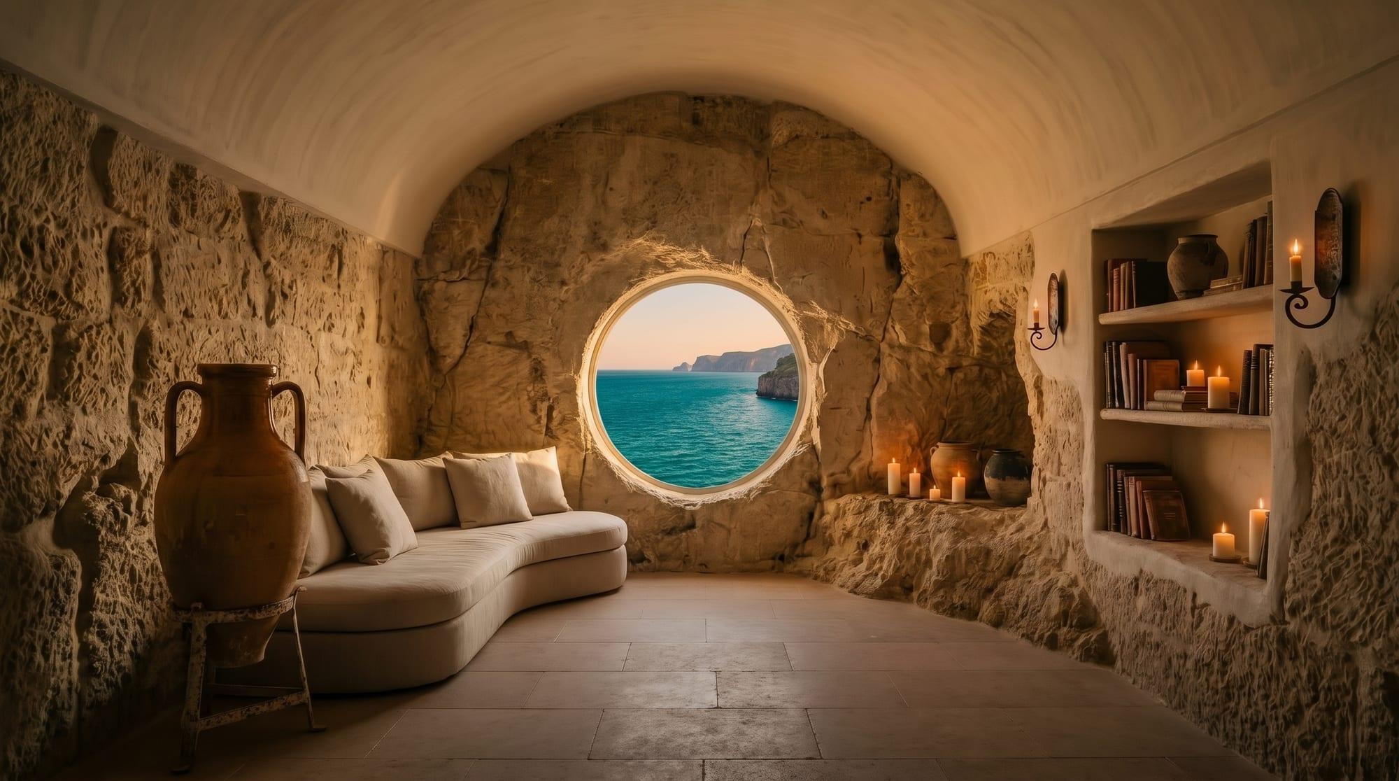
I wanted Ostro to feel like the last hour of a day on the Salento coast: low golden light, warm limestone, the sea always in view.
Ostro is the old Italian name for the south wind. The mark is a compass reduced to one line: a circle with a tick pointing south.
Abril Fatface carries the voice, big and warm, and only in headlines. Comme keeps the details quiet. One word in sun-faded terracotta appears rarely, like a patch of evening light. Colour follows the route: limestone for the rooms, sea teal for the water, dark stone for the night.
One light
Golden hour, the sun low on the left, in every scene.
Real materials
Limestone, linen, terracotta, olive wood. No fantasy colours.
Room for type
Calm areas in each frame, so headlines never fight the image.

04 · Key decisions
The decisions behind the experience
The first screen is a journey, not a slideshow
Scrolling moves the camera: from the sea, through the arched windows, into the rock. The place tells its own story, so the page needs very little copy.
Every section ends in an action
Rooms, spa, dining and boat trips each finish with one clear step: book this room, a treatment, a table or a trip.
Choose a room without leaving the page
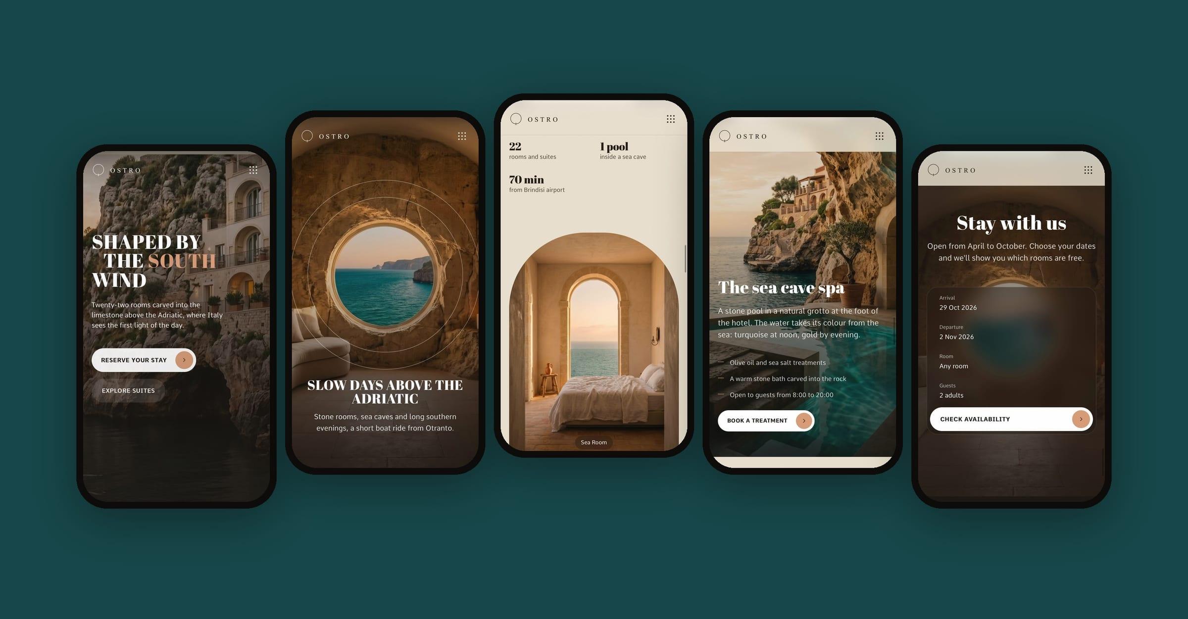
Moving down the list swaps the photo in the arch. “Book this room” jumps to the booking bar with that room already filled in, so guests only add their dates.
One moment, two screens
I designed each moment twice and checked what the guest needs to see first on a small screen. On the phone, the booking bar becomes a card: one field per line and a single button.
Comfortable for everyone
Text keeps its contrast over bright photos, every control works with a keyboard, and people who turn off motion get a calm version where the scenes simply appear.
05 · Result
A working concept, ready to test
The scroll journey, card deck, room switcher, booking bar and booking windows are built and work, on desktop and on the phone.
06 · After launch
What I'd measure after launch
Launch day would be the start, not the end. Once real guests arrived, I'd look at a few clear signals with the owner and adjust the site to what they show.
The first booking click
Whether the scroll journey draws guests in or slows down their first click on “Book”.
Two ways to book
Whether guests use “Book this room” or “Reserve now” in the menu more, so the stronger one gets more room.
Where people stop
Which scene keeps people scrolling and where they leave, so that part can be tightened.
Ostro is a fictional hotel. Its photos and film were generated for this concept.
Your brand, next
Every enquiry opens a sealed bonus for your project.